Product Name: Blogpost Responsive Infographic
Internal Name: CM Blogpost Responsive Infographics
Description: Adding an infographic to a blogpost is easy, but when you look at the image on a mobile it seems to small, so tiny. Adding this module to your blog template makes it possible to upload 3 different infographics. One for desktop, tablet & mobile.
Setup
Step 1 : open the HubSpot Design Tools
- Go to the Design Tools and open your blog template to edit
- Add you CM Blogpost Responsive infographic just below the Blog Content module in the template
- Save the template
- Ready
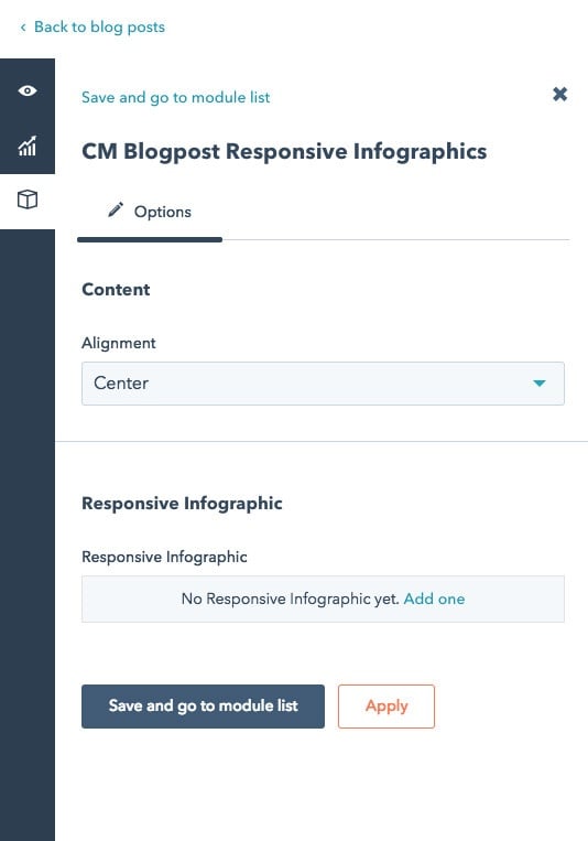
Step 2 : Each time you add/ edit a new blogpost you will see a cube in the left sidebar
Click It and the module sidebar will open, now click on
The new modules opens:
Set alignment to all the infographics, then add a new infographic for each of the 3 different size
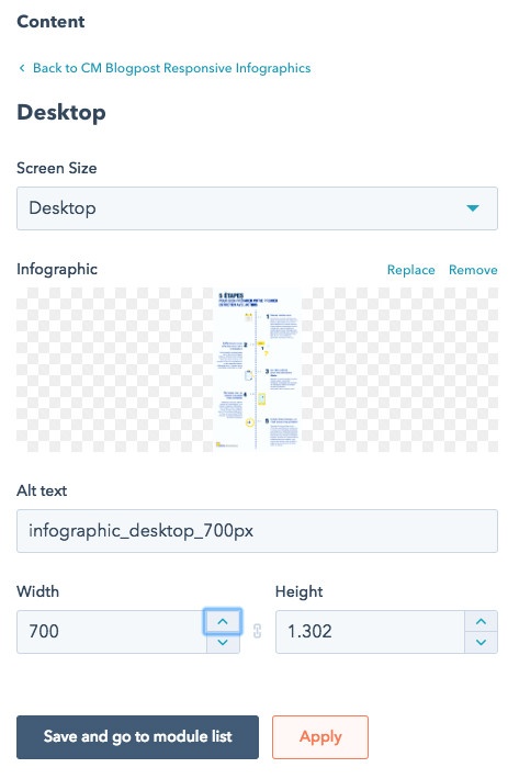
For best result, create 3 different infographic depending the body-width you have available
- one for Desktop - example width 1025px
- one for Tablet - example width 700px
- one for Mobile - example width 400px
Step 3 : If needed tweak the breaking point in the module itself


