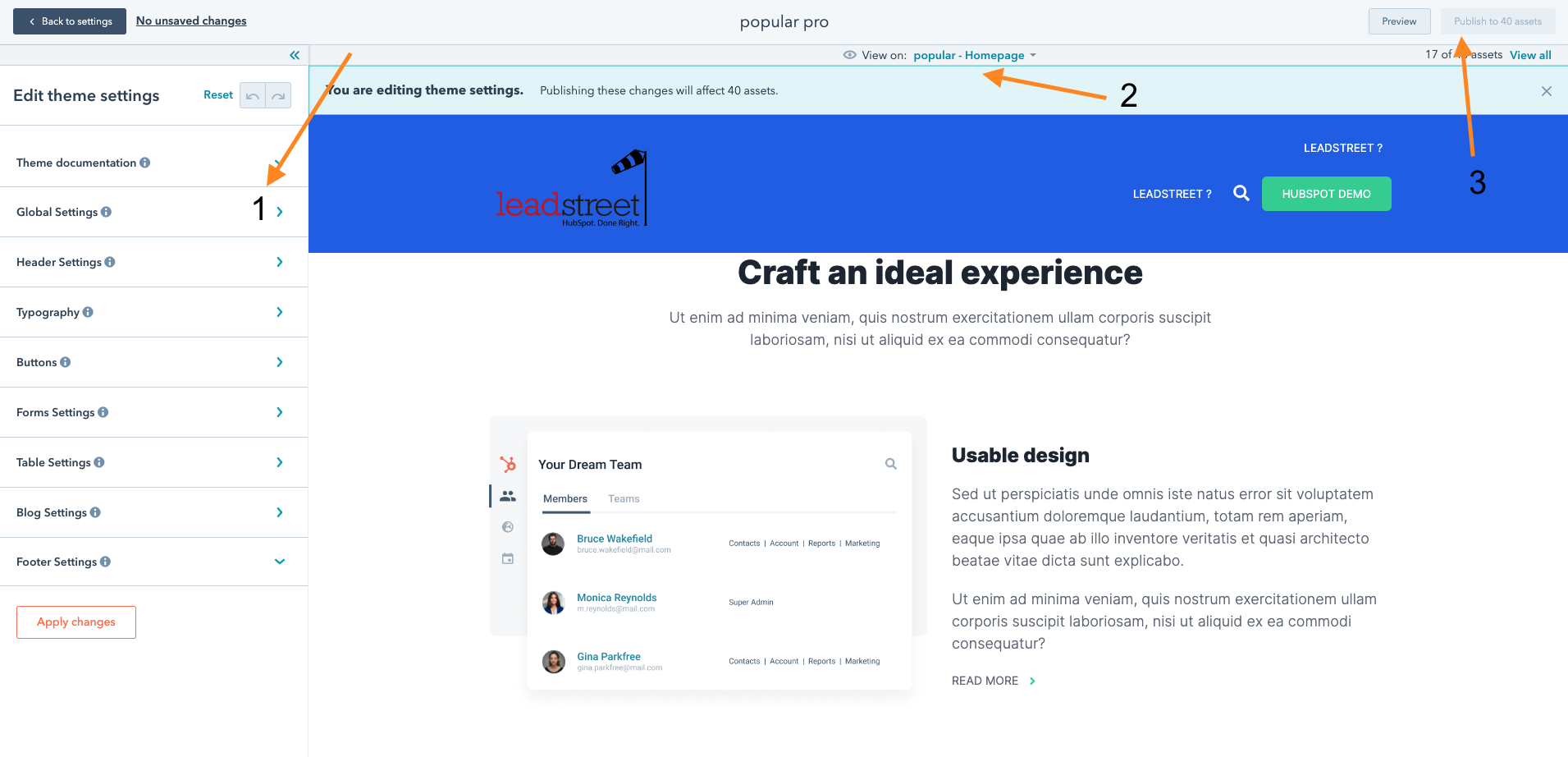
Where are the theme settings located
Go to your settings by clicking on the gear icon in the top right corner. 
In de sidebar select website \ themes
There you will find our popular theme
Click on it and in the new sidebar you will find the theme settings

- Edit the general settings
- Preview then on some page
- Publish the changes
Global Settings
Consider these settings as super settings, they will be inherited further down the road, you can overrule them if needed.

Header Settings
Activate extra functionalities in the header and control all the header variables

Typography
By default, the fonts are inherited from the global font settings. Here you can overrule them if you want to. You can use a different Google Font or a Custom Font (custom fonts are declared in CSS)

Buttons
Create some button variations here, you can use the settings in different modules or use as a class in the source code

Forms Settings
You can control the look of a form and all its elements, field, placeholder, help,...

Table settings
The look of a table can be managed here

Blog Settings
You can control the functionalities focused on the blog, such as listing, hero's, featured,...

Footer Settings
Manage the footer section of each page, width, look, style,...

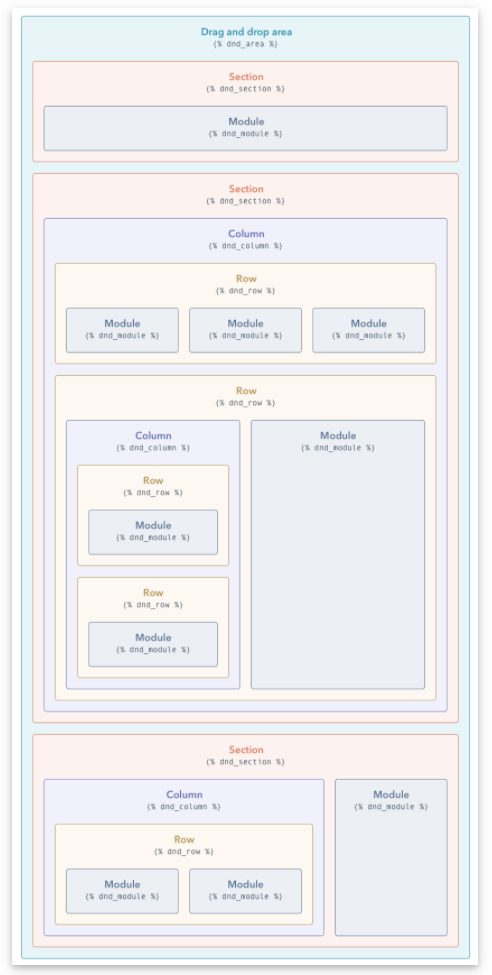
HubSpot drag and drop areas
How HubSpot Drag and Drop Areas are working
Drag and drop areas are composed of modules, which are blocks of website content. These modules may be arranged in horizontal rows or vertical columns. Rows and columns may be grouped into sections of elements.
By grouping these elements together, you can apply background styles to an entire area of your page. You can also drag and drop entire rows, columns, or sections to rearrange your page layout.
- Module: an individual block of website content. You can edit your page's text and images within an individual module.
- Column: a vertical stack of multiple modules or rows. You can move or rearrange columns on your page, and apply a background color or style to an entire column.
- Row (*): a horizontal row of modules or columns. You can move or rearrange rows on your page, and apply a background color or style to an entire row.
- Section: a group of multiple rows or columns. You can move an entire section, or apply a background color or style to an entire section.
Check out this HubSpot knowledge page that explains all functionalities
Different modules
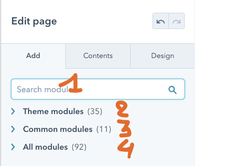
- You can search for modules to be used
- Theme modules are modules developed form, especially for the theme
- Common modules are default HubSpot modules such as Rich Text
- All modules, beware of using these modules, probably they are old modules and NO Drag & Drop modules. It's possible that they do not behave correctly
Section \ Column \ Row \ module hierarchy
(*) creating a row is sometimes hard ;-) but follow these steps and you will get one
- create 2 cols with a Rich Text module in each
- in the first col drag an Image module below the Rich Text field
- then clone the Image module in the first row using the icon when hovering
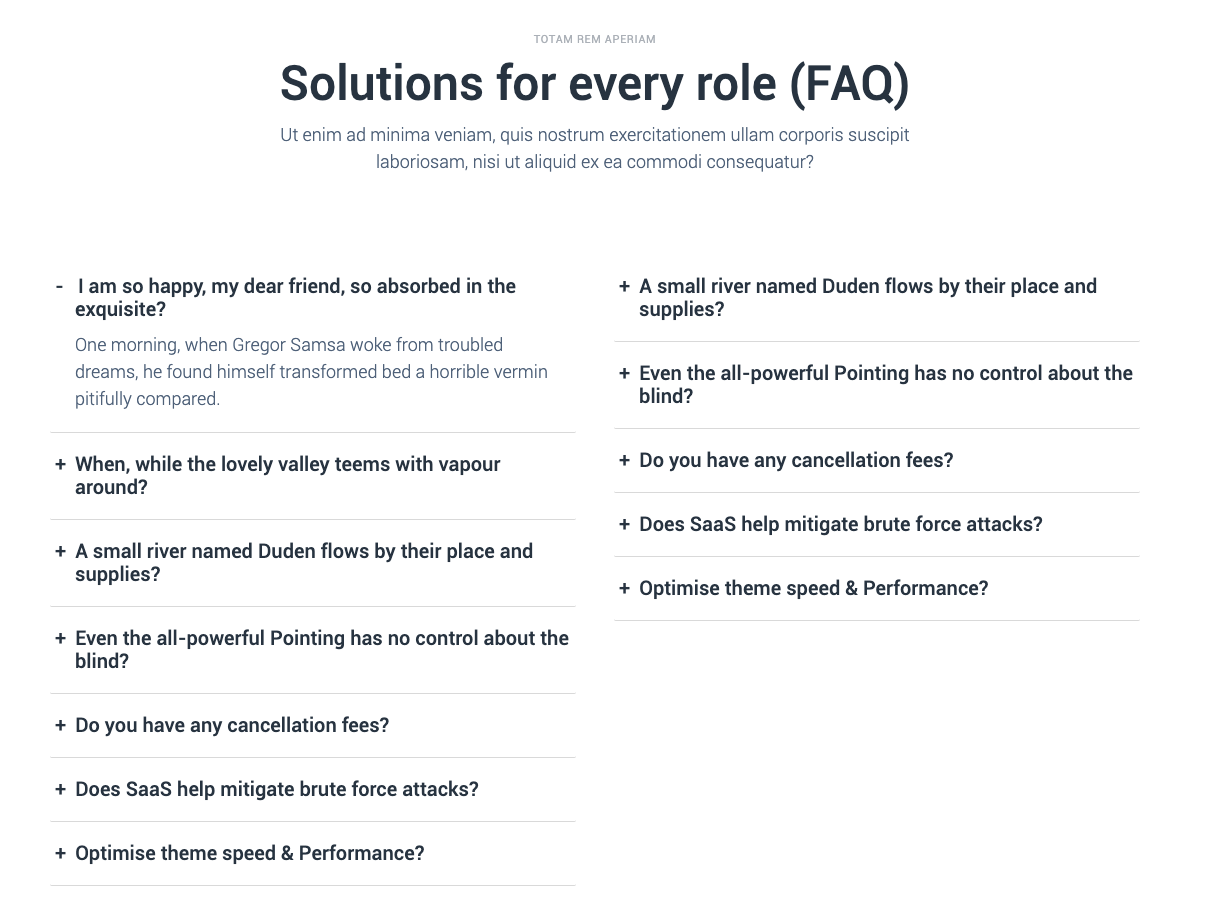
Accordion

This is the module you are looking add, the FAQ or FAQ accordion module
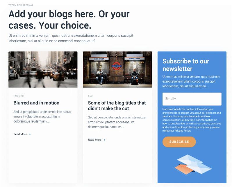
Blog Latest Feed with Newsletter

Display the latest blogs on a webpage, select blog and topic
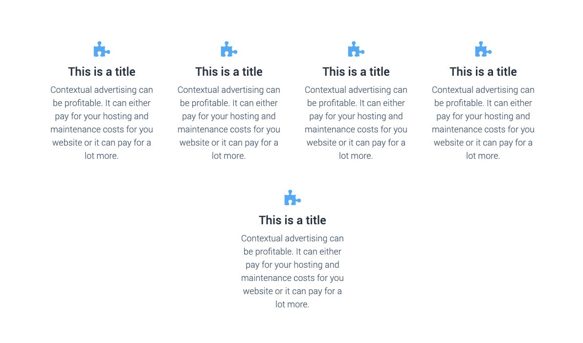
Column/Card module

Use this module to display your team / your products. Each card can hold an image, title, description. Add as many cards as you like, the 5th card automatically goes to the next row.
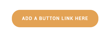
Customizable button/cta

Just add a button on your page and style in in your theme style.
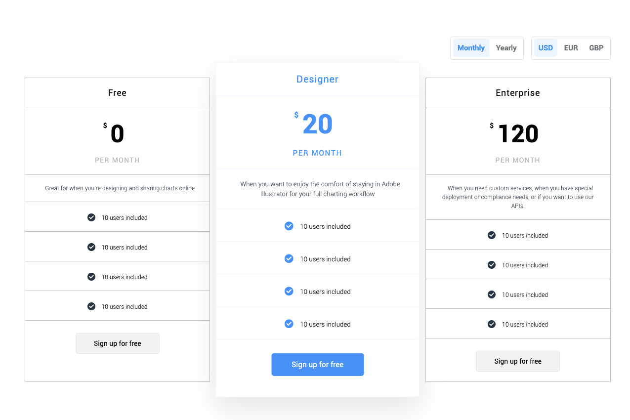
Extended Pricing module

Manage your different pricing plans, use different currencies, switch to monthly & annual pricing.
Footer Column Module

This module is used in the footer, each row of the footer you can add, text, image, social, menu's,...
Think out of the box, use this module as a pillar page navigation.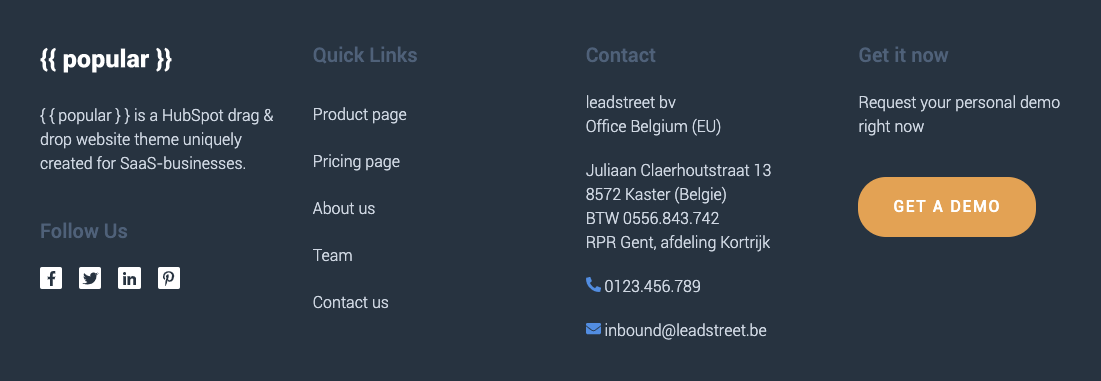
Form with Extra Options

The default Form Module does not contain an option to control the text color of the GDPR text. This Module contains colours field wherein you can modify the text on your form and also lets you control the colour of your submit button.
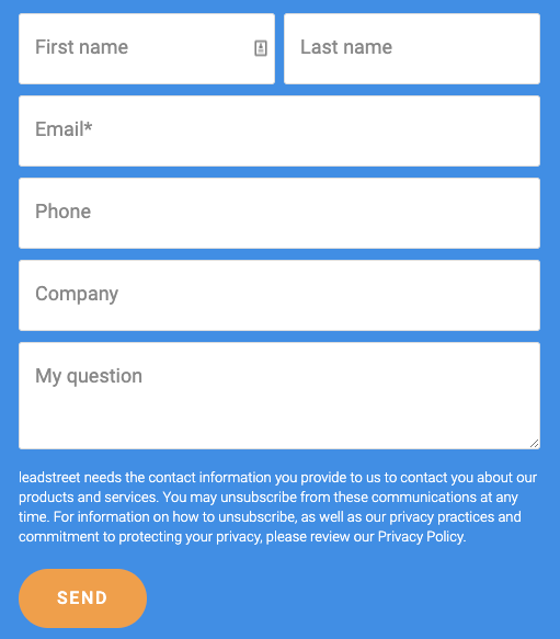
See it in action here
Header CTA
This module is used on the Header

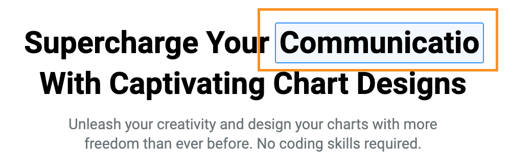
Hero Animated Typing Text

This module is also used to add text on your Hero, the paragraph font size of this module can be controlled on the theme settings (Typography > Hero Paragraphs).
This module lets you add a series of texts that looks like its typing.
Note: Use this keyword "%%typing%%" to insert the typing text on the header.
Hero Floating Background

This module will let you add a floating background color under your hero content.
Note: Make sure the floating background's width matches your hero content width. Make adjustments as needed.

Hero Rich Text with Extra Options

This module is used to add text on your Hero, the paragraph font size of this module can be controlled on the theme settings (Typography > Hero Paragraphs). it also contains a colour field at the bottom, to control the colour of the text.

See it in action here
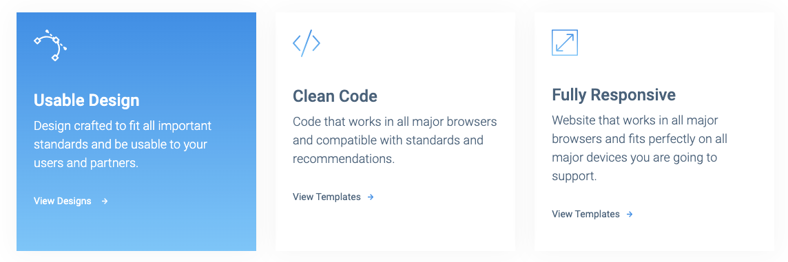
Icon with Text
This module have the ability to control the Background colour, background colour in hover and many more. It will let you add an icon at the top, a text and custom link. Just like the example below:
See it in action here
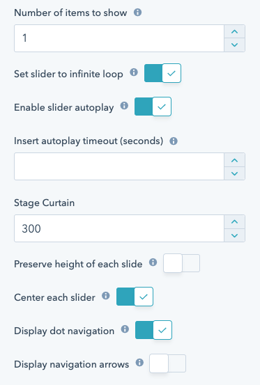
Image Slider

This image slider module lets you control how the slider will behave that fits your needs. It contains options like the items to be shown per slide.
Here the slider settings options available on this module
See it in action here