Made by leadstreet
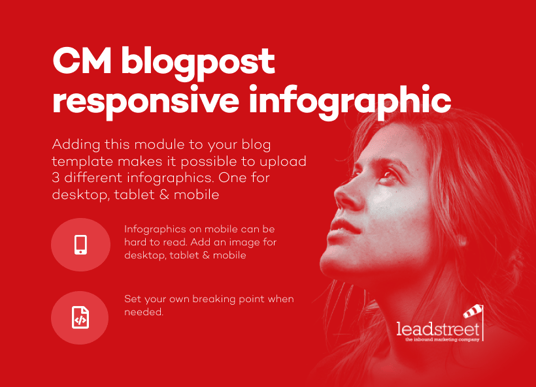
Blogpost Responsive Infographic
Adding this module to your blog template makes it possible to upload 3 different infographics.
Overview
Product Name: Blogpost Responsive Infographic
Internal Name: CM Blogpost Responsive Infographics
Description: Adding an infographic to a blogpost is easy, but when you look at the image on a mobile it seems to small, so tiny. Adding this module to your blog template makes it possible to upload 3 different infographics. One for desktop, tablet & mobile.
Setup
Step 1 : open the HubSpot Design Tools
- Go to the Design Tools and open your blog template to edit
- Add you CM Blogpost Responsive infographic just below the Blog Content module in the template
- Save the template
- Ready
Step 2 : Each time you add/ edit a new blogpost you will see a cube in the left sidebar

Click It and the module sidebar will open, now click on

The new modules opens:

Set alignment to all the infographics, then add a new infographic for each of the 3 different size

For best result, create 3 different infographic depending the body-width you have available
- one for Desktop - example width 1025px
- one for Tablet - example width 700px
- one for Mobile - example width 400px
Step 3 : If needed tweak the breaking point in the module itself


Support
We offer free support on all of our modules. If you have any issues with this module contact our support team and we will be happy to answer your questions.
It's about the people, right?
A highly responsive agency. As someone new to the MAP world since 2015, transitioning from Marketo to HubSpot was seamless. The guidance from the leadstreet team made it an exceptional journey. They have a wealth of knowledge, and if they don't have an answer immediately, they either inform you or find it within 24 hours.
